

Clients


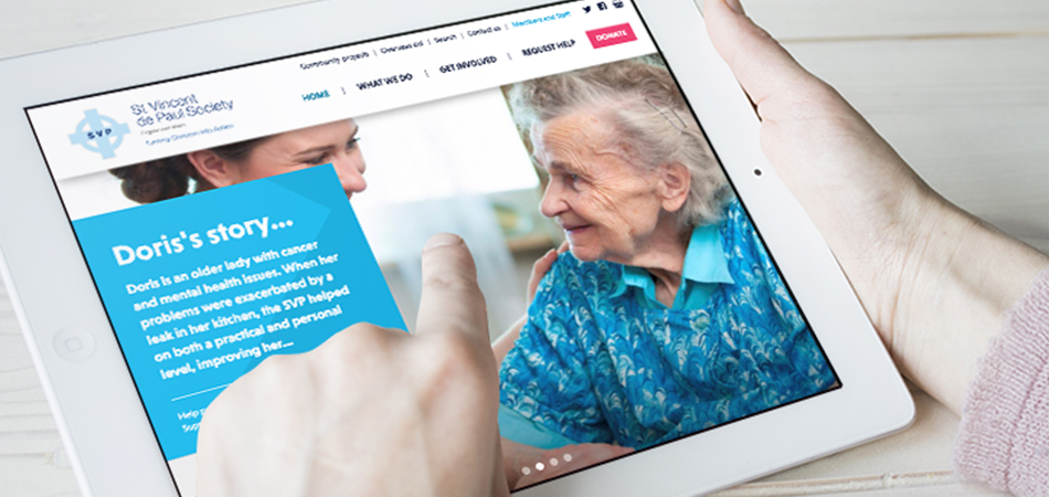
The St Vincent de Paul Society, SVP, turns concern into action by visiting & befriending over 80,000 lonely and isolated people each year in England and Wales, providing practical assistance to anyone in need.
When the consultants at IE Digital first met SVP to talk about what they needed from their new website, we were struck by the number of great stories they had. Letters of thanks and from their beneficiaries, and great examples of the enormous impact that's made by SVP's 10,000 volunteer members. But these success stories weren't evident on the old SVP website. For the new website, IE put these stories front and centre, to show SVP's members, staff, supporters and help seekers all the great work the befriending charity brings to the communities it serves.
We looked at the user journeys and created a user experience to help SVP recruit volunteers, attract donations and help more people.
CloseOur consultant reminded us how many wonderful stories we have to tell, and the value of putting them front and centre on the new website. IE Digital did an excellent job of improving the online user experience, and the new site is helping us to get our mission and message out into the world. Ultimately, it's helping us to achieve our objectives of recruiting more volunteers, attracting more donations and helping more people.
Ken Madine
Head of Fundraising, Communications and Marketing
 Get in touch


A new WordPress website for The Association of Charitable Organisations (ACO). The site provides a hub of support for ACO members while helping them to raise awareness of the valuable work of benevolent charities.
CloseWe are thrilled with the new website IE Digital has developed for us. From discussing our brief in an initial meeting, IE clearly demonstrated from the outset that they had listened to our ideas and understood our vision to create a modern and eye-catching new website that also acted as an effective hub of information and resources for our member charities, and we are really pleased with the design they came up with for us.
Hannah Canner
The team at IE have always been responsive to our comments and feedback throughout the process, and it has been a pleasure to work with them on this project.
Marketing & Communications Manager at ACO
Get in touch


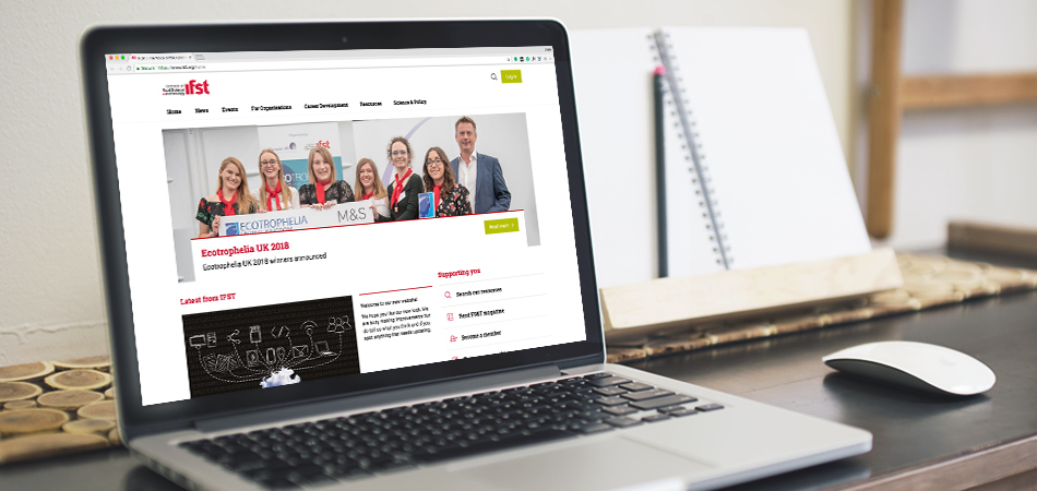
The Institute of Food Science and Technology (IFST) is the UK’s leading professional membership body for all aspects of food science and technology. They advance these disciplines based on impartial science and knowledge sharing.
IE Digital was appointed to give the IFST website a complete overhaul, particularly to improve the user experience for membership registrations.
In phase one, we rebuilt the Drupal 7 website and enhanced the existing CiviCRM integration, including replacing their paper-based membership sign up with a online sign up process including payment. A simple pre-qualification questionnaire replaces the many pages of membership information on the old site, and guides users through the registration process including the option to sign up to various membership types and professional registers. The new site simplifies content management, and gives a greater presence to resources and events.
Close
Get in touch


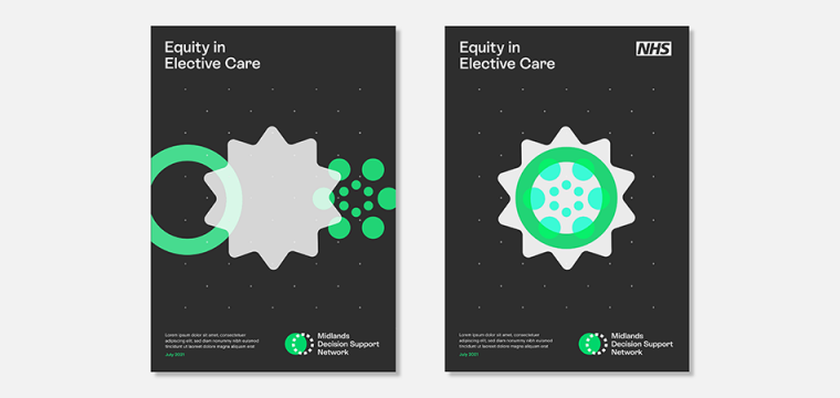
The Midlands Decision Support Network brings together 12 decision support units across the Midlands region to share experiences, exchange great practice and improve outcomes. The network is run by the NHS Midlands and Lancashire Commissioning Support Unit, for whom IE had already created The Strategy Unit and Digital Innovation Unit brands.
The Midlands Decision Support Network asked IE to create their new brand and WordPress website. The visual identity includes a set of circular graphics, typically shown in threes, and a vibrant colour palette of lime green, charcoal, electric blue and putty. The graphics represent networks and data coming together – logically and systematically – through applied intelligence and decision making.
Close
Get in touch


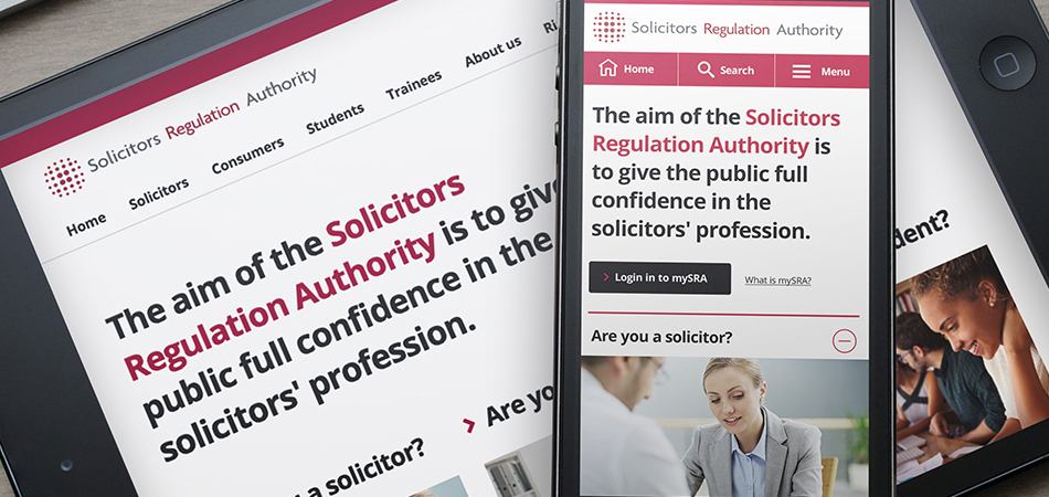
Solicitors Regulation Authority (SRA) is the industry regulator for solicitors and law firms in England and Wales. Their website has grown organically over ten years, leading to a massive site with an inconsistent, clunky and dated user experience that – if left unchecked – could undermine public confidence in the solicitors' profession. The SRA wanted to bring the site up to date and greatly improve the overall user experience (UX), especially on mobile devices, without replacing the site or their existing Content Management System (CMS).
Following an initial review of some core templates, IE Digital took an Agile approach to producing a brand new digital design. With an overall strategic objective of improving consistency and usability, we looked at every component of the site at the “Atomic” level.
We created new, responsive digital design patterns and tested them with real users, using disposable rapid prototyping, iterating existing designs and adding new patterns at each stage. Finally, we documented each pattern and how it should be used and provided detailed html, css and javascript for implementation via the SRA’s CMS and within a set of new online services.
Read more about the Solicitors Regulation Authority website.
CloseThe guys at IE Digital are exemplary collaborators. They’ve engaged successfully with people at all levels of the SRA and are a trusted part of our team. With IE Digital, we’ve taken a major step forward in the quality of user experience, dramatically improved our UI and design governance, and created buy-in for user-centred design across our organisation.
John Rieger
Head of Digital Communications, Solicitors Regulation Authority
Get in touch


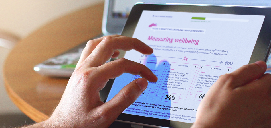
The Open University promotes educational opportunity and social justice by providing high-quality university education to all who wish to realise their ambitions and fulfil their potential. OpenLearn – is the OU's home of free learning.
IE Digital created bespoke, interactive learning content for OpenLearn to help learners to discover foundation-level content on topics of interest. It's designed to whet their appetites and hopefully encourage them to look at taking their educational journey further.
Supreme Streets: An Adventure Into Employee-Ownership is a standalone piece of beautifully-illustrated interactive content, designed and built by IE Digital. The Q&A-based activity illustrates how employee-owned enterprises are set up and run, as part of OpenLearn's Money and Management subject area.
CloseWe went to IE Digital with a brief to develop bespoke learning content... The idea elegantly evolved into a stylish and informative interactive feature. "Journeying through Wellbeing" combines storytelling with real-world examples, making it a valuable and rewarding learning experience for our OpenLearn audience. The team at IE Digital were professional, organised and clearly passionate about delivering high-quality learning. It was a pleasure to work with them on this project.
Sarah Bridgman
Online Project Producer (OpenLearn), Open University
Get in touch


The Lighting Industry Association (The LIA) is Europe’s largest trade association for lighting equipment professionals. In preparation for a pivotal year of development and change, and a period of intense growth, the LIA needed a new website to provide a window into its work for the public, government and other stakeholders.
IE is has designed and built a modern, flexible digital platform for the LIA. As well as providing a home for members to access extensive technical content, the site is also the gateway to the LIA's industry-backed Lighting Industry Academy. This is an industry-wide hub for the development and delivery of high-quality learning for the whole lighting supply chain.
The LIA is committed a rolling programme of further website developments to support its member organisations, following an iterative process.
CloseThe Lighting Industry Association’s new website is now live and better than ever. More than just a cosmetic makeover, the new site is more intuitive and has the ability to tailor itself to the interests of the person using it.
The Lighting Industry Association
Get in touch


World Vision is an international Christian charity who work to make a sustainable impact on poverty and its causes, especially as they affect children. World Vision engaged IE to create a host of interactive, educational and campaign content – to engage teachers, schoolchildren and churches in their work, and to raise their profile as a significant NGO.
Our work included content creation such as films, games and interactive screensavers, delivered online, by email and – initially – as resources on CD-ROM or DVD. IE used methods as diverse as kinetic typography, sound design, animated photo-montage and a ‘live’ Indian shadow-puppet to bring the work of World Vision to life through personal stories.
One particular campaign used an interactive Advent calendar, launched to coincide with World AIDS Day, which enjoyed an incredible 195% response rate to the initial email, as over a quarter of those who downloaded the screen saver passed it on to at least one friend.
CloseWithout IE’s innovative approach we would certainly have missed the opportunity to launch the Take2 campaign around World AIDS Day. IE have brought great flair and originality to a demanding project.
Jonathan Francis
Church Education Officer
Get in touch


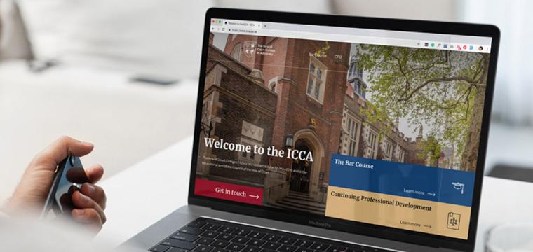
The Inns of Court College of Advocacy (ICCA) is the educational arm of the Council of the Inns of Court. They design and deliver a number of bespoke legal advocacy training and CPD courses, including a new two-part Bar Course.
As ICCA gradually moves towards delivering more of its learning content online, they realised their existing website wasn't up to the task. IE Digital designed and built a new WordPress website, creating a platform to host ICCA's legacy content and support the search and retrieval of new digital learning materials. It's also future-proofed for any integration with e-learning platforms in the future.
IE's designers created a modern new visual identity with a premium feel, including a set of ‘digital brand’ guidelines. We updated the logo to reproduce better online, and added a prestige colour palette, a bespoke icon set and pattern, and beautiful photography taken on location at the College with real students and practitioners. We also created various pieces of core collateral and templates to support ICCA's marketing team.
CloseWorking with IE Digital has been a very positive experience. They quickly understood what we wanted to achieve and the development process went extremely smoothly. The result is a website which not only looks great, but is thoughtfully designed and easy to administer. We are looking forward to a long and productive partnership!
Adrian Clarke
Digital Manager, The Council of the Inns of Court (COIC)
Get in touch


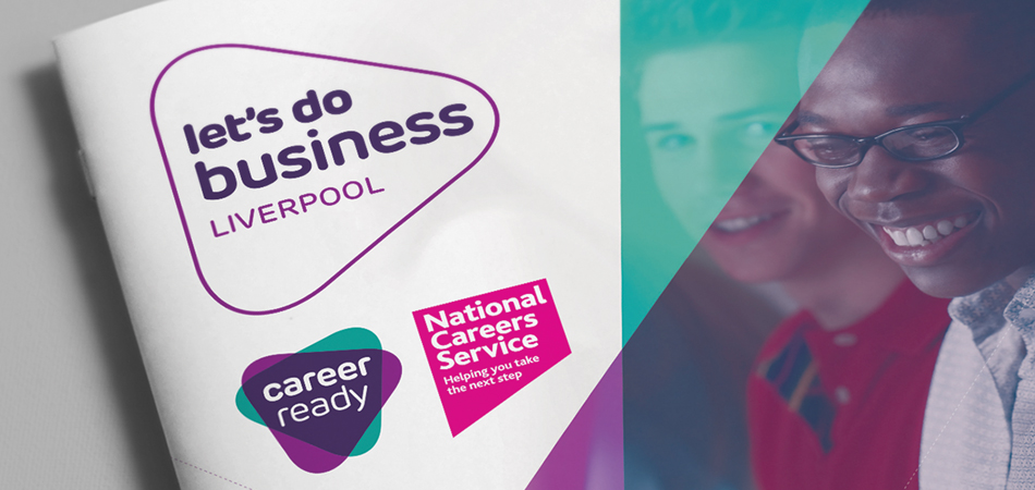
Career Ready is a national charity that links education with business to prepare young people for the world of work.
Explore the full case study for the Career Ready volunteer management system.
CloseCareer Ready now has a website that proudly promotes its achievements and impact as a leader in the employer engagement field, and an operating platform on which to grow. The web-based system saves both the charity and schools from complex and costly admin. This in turn has meant we have been able to reduce costs for budget-stretched schools, and reach more young people than before.
Anne Spackman
Chief Executive
Get in touch


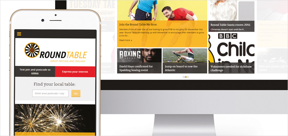
Round Table is an international organisation with over 34,000 members, standing for fun and friendship, service in the community and unique and everlasting friendships.
CloseIE brought fresh thinking to our website, challenging us to focus on our users. As well as evolving parts of our web presence, IE has simplified some of our complex internal systems, improving our efficiency and performance.
Cait Allen
Chief Executive
Get in touch


West Midlands Fire Service serves a population of 2.8 million citizens, making it the second biggest fire and rescue service in the UK.
Explore the full case study on West Midlands Fire Service's Activity Assistant.
CloseIE took a business-critical but clunky system and added a modern and intuitive, responsive user interface. IE’s expert digital consultants, front-end developers and UX designers supported the in-house development team and created a slick, beautiful system that makes data entry faster for our users, and that we are proud to offer to other fire services.
Kash Singh
Systems Development Manager
Get in touch


The Money Advice Trust is a national charity, helping people across the UK to tackle their debts and manage their money with confidence. IE Digital's consultants conducted user research for some of their consumer websites.
Close
Get in touch


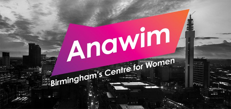
Anawim helps women in and around Birmingham. Their Women’s Centre is a safe space for those struggling with trauma, the criminal justice system, domestic abuse, addiction, mental health, sexual exploitation – any woman who needs their help. Their wrap-around services and specialised caseworkers can transform women’s lives.
Read our full case studies on how we rebranded the charity, and how we designed and built their new website.
CloseWorking with IE has been transformative for Anawim. The level of research undertaken with such a broad range of Anawim’s women, staff, volunteers and supporters has enabled us to really delve into what makes Anawim unique and enabled us to work together to realise who we are and what we stand for. We have no doubt that our new brand will not only enable Anawim to reach more women who need support, but will also encourage more people to engage with, fund and learn more about Anawim and its values.
Emily Johnson
Fundraising and Communications Manager
Get in touch


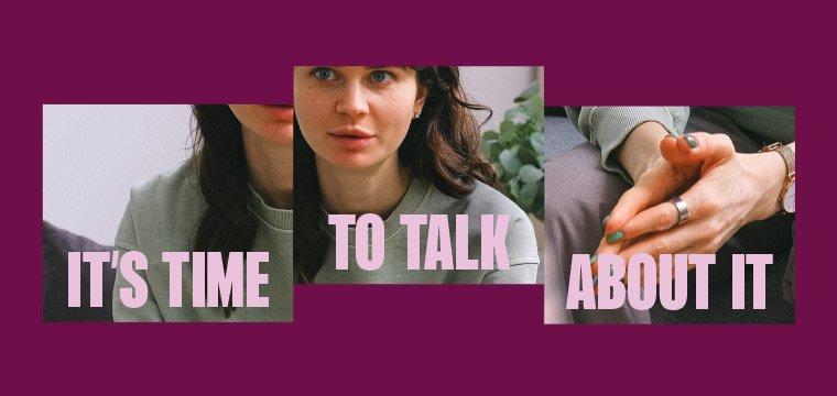
Branding and website design for a new NHS campaign brand. Time to Talk comes from NHS West Sussex Talking Therapies, part of Sussex Community NHS Foundation Trust.Time to Talk offers a free, confidential service for adults in West Sussex. It's the only NHS Talking Therapies provider in West Sussex, and one of the leading services in the country. They provide a range of talking therapies and other treatments for adults with mild to moderate anxiety and depression, and other mental health conditions.
Close
Get in touch


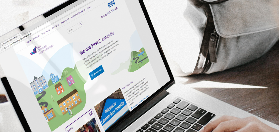
Part of the NHS family, First Community Health and Care is a not-for-profit social enterprise providing community healthcare services. First Community’s mission is to help people to stay in their own home, promoting independence, wellbeing and preventing unnecessary hospital attendance or admissions.
In 2014, IE was commissioned to craft an inspiring visual identity and incorporate this into a responsive CMS-driven website. We built on First Community’s strong reputation amongst patients – bringing clarity and consistency of messaging and brand to their key target audiences. We held qualitative stakeholder interviews, mapped their audiences and competitors and positioned the brand with a redefined proposition, key messaging and tone of voice.
IE created a future-proofed brand architecture to prepare First Community for expansion, and delivered a new visual identity, brand guidelines and collateral templates. The work was brought to life online with a new website and social media profile. We also developed First Community's new intranet, and then in 2018 the site underwent a complete rebrand following a move to a more illustration-heavy brand that encompassed the ideals of community, family and a friendly range of medical support services.
See the site for yourself at firstcommunityhealthcare.co.uk.
CloseWe selected IE due to their evidenced based methodology. The project was fantastically managed and kept to time. IE pushed us to think outside the box, challenging our processes and setting success criteria for the project. Our relationship with IE worked so well we have continued to work with them to design our marketing collateral and website.
Liz Hobby
Communications Manager
Get in touch