Digital Clients

IE Digital works with charity, health and education clients up and down the UK, as well as internationally. Sometimes we work for large charities and universities that are household names, and sometimes we help small health and social care providers, colleges, or startups with big ambitions. If you’re a values-driven organisation looking for a charity website, a healthcare app, or a university website, then we’d love to add you to our list of clients!

Off
  • New logo for UCCF: The Christian Unions designed by IE Brand
    New logo for UCCF: The Christian Unions designed by IE Brand

    The new UCCF website designed by IE Digital

    Christian Unions are student-led mission teams that operate at the heart of university and college campuses – students reaching students with the good news of Jesus. UCCF: The Christian Unions supports student leaders in this work.

    Having refreshed the charity's visual identity and logo, IE supported the in-house development of a new website. We delivered digital consultancy and created the overall user experience and user interface design for the site. We also developed an integrated, digital-first campaign to help UCCF reach out to their audiences in new ways, including their first social media advertising across Facebook and TikTok.

    Read the full case study on how we rebranded UCCF and created the campaign. 

  • Young Lives vs Cancer logo in grey
    Young Lives vs Cancer logo

    CLIC Sargent community app on mobile phone

    Young Lives vs Cancer (formerly CLIC Sargent) is the UK’s leading cancer charity for children, young people and their families.

    Explore the full case study about the Young Lives vs Cancer community app. 

    We came to IE with a complex brief for our online community. IE focused on the essential principles, actualising this into an intuitive website that will help Young Lives vs Cancer build a vibrant space for 16 to 24-year-olds, who have, or have had cancer.

    Helen Thomas-Fox
    Senior Digital Manager, Young Lives vs Cancer
    Close Get in touch Get in touch Get in touch
  • Christian Vision logo (grey)
    Christian Vision logo

    Christian Vision LiveStats dashboard

    International charity Christian Vision’s goal is to ‘Touch a billion’ by 2020. LiveStats is a responsive dashboard app that monitors impact, activity and engagement across Christian Vision’s thirty-seven international websites and six social media channels, enabling donors to visualise the work of the charity in real-time as people share, engage with content and commit to social action.

    Live Stats shows data for not one, not two but 21 Christian Vision websites! This enables users to view – in real time – people visiting the websites, engaging and sharing content.

    The Live Stats official launch took place on Tuesday 11 October with 40 people in attendance – the website itself attracted an overwhelming 400 unique visitors within the first 24 hours!

    Everyone is really proud of the work that IE has done and thrilled to be able to show how much Christian Vision is achieving through the Live Stats website.

    Gavin Mills
    Digital Operations Specialist
    Close Get in touch Get in touch Get in touch
  • Langley Trust logo in grey
    New Langley Trust logo by IE Brand

    Billboard poster mock up for Langley Trust featuring a man in a garden with his back to the camera. The main headline says "Time for a fresh start" and there's a statistic that 39% of released prisoners reoffend due to a lack of opportunities and support. Providing a safe and nurturing environment for them can make all the difference.

    Langley Trust is a Christian charity that helps people with convictions to transform their lives. They believe everyone deserves another chance.

    Across the UK, they support prison-leavers, promoting rehabilitation and reducing the risks of re-offending.

    They tasked IE Brand with supporting them through a rename and rebrand project, to reflect the exceptional organisation they are. The rebrand and a new WordPress website launched in September 2023 alongside Langley's 65th anniversary celebrations.

    Read the full Langley Trust case study

    IE have been a creative joy to work with. From start to end they were clear about their processes and methodology, we had fun working together despite pretty much all of this being online. We are delighted at the results, a new brand, brand guidelines, messaging matrix and a website. Everything came in on time and to budget. Despite a significant staff change at our end and Langley being a dispersed organisation, IE worked with our project leaders professionally, calmly and with the creative energy we had hoped for. Thanks IE it’s been a blast!

    Rev Andy Rider
    Director of Chaplaincy Services
    Close Get in touch Get in touch Get in touch
  • Public Health England logo (grey)
    Public Health England logo

    Public Health England – health app endorsement system

    Public Health England (PHE) is an executive agency of the Department of Health, which exists to protect and improve the nation's health and wellbeing, and reduce health inequalities.

    Explore the full Public Health England case study.

    IE has distinguished itself from other G-Cloud suppliers through their positive, pragmatic approach. Their multi-disciplinary team embraced the challenge of a complex, strategically significant digital service project with multiple stakeholders, users and audiences.

    Diarmaid Crean
    Deputy Director, Digital
    Close Get in touch Get in touch Get in touch
  • FPA Family Planning Association logo in grey
    FPA Family Planning Association logo

    Sexwise: Sexual health campaign brand for FPA featuring colourful collage illustrations

    Sexual health charity FPA needed a distinctive brand and a mobile-friendly website for its new campaign. IE Digital brought the campaign brand to life online, and created a user-friendly contraception comparison tool, to help people make informed decisions about fun, safe sex. 

    Explore the full case study about the Sexwise website. 


    We needed an agency to help us develop a sex-positive, digital-first new brand to get health information to the public. At the pitch, IE impressed us with their expertise, agile approach to digital and enthusiasm for the project.

    For the website, IE's digital consultants helped us to define the key user personas and their journeys. The content is clearly presented and easy to navigate, while the contraception comparison feature is a useful tool to help people make informed decisions about what’s right for them.

    We enjoyed working with the IE team and we're really delighted with the end result.

    Bekki Burbidge
    Deputy Chief Executive, FPA
    Close Get in touch Get in touch Get in touch
  • Let's end poverty logo
    Let's end poverty logo

    Let’s End Poverty is a diverse, growing movement of people who are united behind a vision for a UK where poverty can’t keep anyone down. Anyone can be part of the movement, whether you’re an individual, a group, a faith community, a business or an organisation.

    IE created the colourful campaign brand and Let's End Poverty website

  • Read Easy logo with icon representing two people looking at a book. In dark grey
    Read Easy logo with icon representing two people looking at a book. Colours are orange and navy blue.

    Read Easy UK home page shown on a laptop screen

    Read Easy UK is a national charity that recruits, trains and supports volunteer reading coaches. These coaches give one-to-one tuition to adults who struggle with reading – a hidden problem affecting millions of people.

    Read Easy was about to gain a significant PR boost, thanks to a charity appeal with Richard Madeley on BBC Radio 4. To capitalise on this, the charity needed a top-notch, accessible website to support its goals to increase donations and recruit volunteers.

    With the launch date set and a massive uptick in web traffic expected in the short term, testing and resilience were crucial. 

    Read the full Read Easy case study

    I am so proud of our new website, it looks absolutely fantastic! I’m overwhelmed by what everyone has achieved between them – both at IE Digital and the Read Easy team too. IE immediately understood our mission as a charity, and the significance of the Radio 4 appeal for us. They listened to what we needed and went above and beyond, taking every possible precaution to ensure a successful launch. Thank you so much to everyone involved. I couldn’t be more pleased!

    Ginny Williams-Ellis
    Chief Executive, Read Easy UK
    Close Get in touch Get in touch Get in touch
  • University of Nottingham logo
    University of Nottingham logo

    International student

    With campuses in the UK, China and Malaysia, the University of Nottingham is a truly global institution, providing innovative and engaging education and producing world-leading research. It was the first British university to establish a campus in Malaysia, in 2000, and the first foreign university to open a campus in China, in 2004.

    IE worked with the international recruitment team at the University of Nottingham to improve its online international student recruitment. We carried out quantitative and qualitative research into user needs – interviewing both international students and agents – and mined their Google Analytics data for insight. This led to the definition of user personas, and user journeys being recorded, re-shaped and iteratively optimised. IE's consultancy informed the work of Nottingham's in-house development team, who handled all information architecture and build changes.  We also provided user experience and creative design assets, generated within the strict confines of their CMS. 

    More recently we worked with the University of Nottingham again on the AgriFood Training Partnership website and brand

    IE led us through a clear, streamlined process to enable all stakeholders to develop and adhere to success criteria, with clear outputs to help support buy-in.

    International Recruitment Team
    Close Get in touch Get in touch Get in touch
  • Young Enterprise logo - YE in grey
    Young Enterprise logo - YE

    Young Enterprise new wordpress website by IE Digital

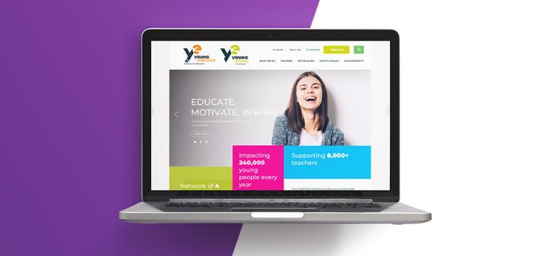
    Young Enterprise (YE) is the UK’s leading enterprise and financial education charity, reaching over 315,000 young people every year. They make the connection between school and the world of work by helping young people to build key skills. They merged with financial education charity pfeg (now Young Money) in 2014, continuing to operate two separate websites, before appointing IE Digital – a long-standing partner of both charities – to bring the two together.

    IE Digital developed a single, intuitive new website that would be more efficient for staff to maintain through a single CMS. It needed to feature improved user journeys for their key audiences of teachers/careers advisors (primary and secondary schools, colleges, universities etc.) and investors (e.g. corporates, major donors, trusts and ambassadors). Additional users to consider ranged from YE alumni and volunteers, to the media and Government stakeholders.

    Built in WordPress, the highly flexible site is based around a module-builder style functionality, to allow YE to create a wide variety of pages, while keeping everything consistently on brand. We followed a highly collaborative design process to take into account the specific needs of the client. The site integrates with ProgressCRM to facilitate subscriber-only access to lesson plans and CPD training materials for educators. Meanwhile, we introduced clearer calls to action and an intuitive donation path for investors, to improve conversion rates.

    The result is a modern, vibrant site to communicate the charity’s mission, work, overall impact, and individual success stories.

    Read more about the Young Enterprise website

  • Salvation Army logo (grey)
    Salvation Army logo

    Salvation Army in the community

    The Salvation Army is a church and charity providing services in the community to those who are vulnerable and marginalised. Motivated by its Christian faith it offers practical support and services in over 700 centres throughout the UK and Republic of Ireland to all who need them, regardless of ethnicity, religion, gender or sexual orientation. It seeks to influence social policy and practice in its fight for greater social justice.The Salvation Army is a global church and works in 130 countries around the world.

    The Salvation Army engaged IE on the high-level strategy and user experience challenge of digitising their various printed publications, and on the redesign of their School for In-Service Training and Development's online presence.

  • Locality logo in grey with strapline beneath "The power of community"
    Locality logo with strapline beneath "The power of community"

    Photo of a little boy sticking a drawing of a rainbow of a rainbow in the window of his house, something that became popular during the Covid-19 lockdowns

    Locality is the national membership network for community organisations in the UK. They support community organisations to be strong and successful so communities thrive.

    IE Digital conducted user research for the Locality website. 

  • Clergy Support Trust logo in grey
    Clergy Support Trust logo in purple. The word Support has the letter "t" highlighted in orange, in the shape of a cross.

    Clergy Support Trust brand photography

    Clergy Support Trust helps Anglican clergy and their families in times of need. They offer grants and wellbeing support to members of the clergy (including ordinands and retired clergy), as well as their dependants and partners – whether married, separated or widowed. 

    IE renamed and rebranded the charity from 'Sons & Friends of the Clergy' to Clergy Support Trust, creating a new visual identity and bringing it to life online through a new Drupal 8 website. Our research showed that the ability for users to check if they are eligible for financial support would be a great addition to the website. We built an 'Eligibility Checker' tool, available from the home page, which allows beneficiaries to quickly and discreetly explore their eligibility, removing some of the barriers to asking for help. 

    See it for yourself at clergysupport.org.uk

    IE Brand came on board at a time of considerable change for our 364-year old charity, which supports Anglican clergy and their families. Our old brand was part of our history, but was no longer relevant or accessible to today’s clergy. IE Brand helped with stakeholder engagement and in establishing the case for change through beneficiary research. We’re delighted with our new name and visual identity, which will enable us to reach more clergy families in need. We were impressed with the IE team, and have also now entrusted them with redesigning our website.

    Jeremy Moodey
    Chief Executive, Clergy Support Trust
    Close Get in touch Get in touch Get in touch
  • St Vincent de Paul Society (SVP) logo in grey
    St Vincent de Paul Society (SVP) logo

    IE Digital designed and developed a new website and UX for befriending charity SVP

    The St Vincent de Paul Society, SVP, turns concern into action by visiting & befriending over 80,000 lonely and isolated people each year in England and Wales, providing practical assistance to anyone in need.

    When the consultants at IE Digital first met SVP to talk about what they needed from their new website, we were struck by the number of great stories they had. Letters of thanks and from their beneficiaries, and great examples of the enormous impact that's made by SVP's 10,000 volunteer members. But these success stories weren't evident on the old SVP website.  For the new website, IE put these stories front and centre, to show SVP's members, staff, supporters and help seekers all the great work the befriending charity brings to the communities it serves.

    We looked at the user journeys and created a user experience to help SVP recruit volunteers, attract donations and help more people. 

    Read the SVP website case study.

    Our consultant reminded us how many wonderful stories we have to tell, and the value of putting them front and centre on the new website. IE Digital did an excellent job of improving the online user experience, and the new site is helping us to get our mission and message out into the world. Ultimately, it's helping us to achieve our objectives of recruiting more volunteers, attracting more donations and helping more people.

    Ken Madine
    Head of Fundraising, Communications and Marketing
    Close Get in touch Get in touch Get in touch
  • ACO logo (The Association of Charitable Organisations) in grey
    ACO logo (The Association of Charitable Organisations)

    Group of people at an event laughing and clapping

    A new WordPress website for The Association of Charitable Organisations (ACO). The site provides a hub of support for ACO members while helping them to raise awareness of the valuable work of benevolent charities.

    Read more on the IE blog

    We are thrilled with the new website IE Digital has developed for us. From discussing our brief in an initial meeting, IE clearly demonstrated from the outset that they had listened to our ideas and understood our vision to create a modern and eye-catching new website that also acted as an effective hub of information and resources for our member charities, and we are really pleased with the design they came up with for us.

    The team at IE have always been responsive to our comments and feedback throughout the process, and it has been a pleasure to work with them on this project.

    Hannah Canner
    Marketing & Communications Manager at ACO
    Close Get in touch Get in touch Get in touch
  • Institute of Food Science and Technology (IFST) logo (grey)
    Institute of Food Science and Technology (IFST) logo

    New website for membership association IFST Institute of Food Science + Technology

    The Institute of Food Science and Technology (IFST) is the UK’s leading professional membership body for all aspects of food science and technology. They advance these disciplines based on impartial science and knowledge sharing.

    IE Digital was appointed to give the IFST website a complete overhaul, particularly to improve the user experience for membership registrations. 

    In phase one, we rebuilt the Drupal 7 website and enhanced the existing CiviCRM integration, including replacing their paper-based membership sign up with a online sign up process including payment. A simple pre-qualification questionnaire replaces the many pages of membership information on the old site, and guides users through the registration process including the option to sign up to various membership types and professional registers. The new site simplifies content management, and gives a greater presence to resources and events. 

    Read more about the IFST website